![]() Posted by Cameron Francis
on
10 Jun , 2014
in
News Uncategorized
Posted by Cameron Francis
on
10 Jun , 2014
in
News Uncategorized

The cold reality of the modern web is that there are billions of sites on the web and most of them have a goal of increasing their traffic and maximising their conversions.
How can you possibly make your site stand out? You can use heatmaps to improve conversions.
The answer is to appeal to the subconscious thoughts of your visitors. Subconscious behaviours are frequently the most powerful because many of them are universal, since most humans are similarly hardwired. In addition, people are not often aware of their subconscious thoughts and consequently, they have no control over them.
If you are able to appeal to your visitors’ subconscious, you will be able to influence their conscious decisions, and drive more conversions.
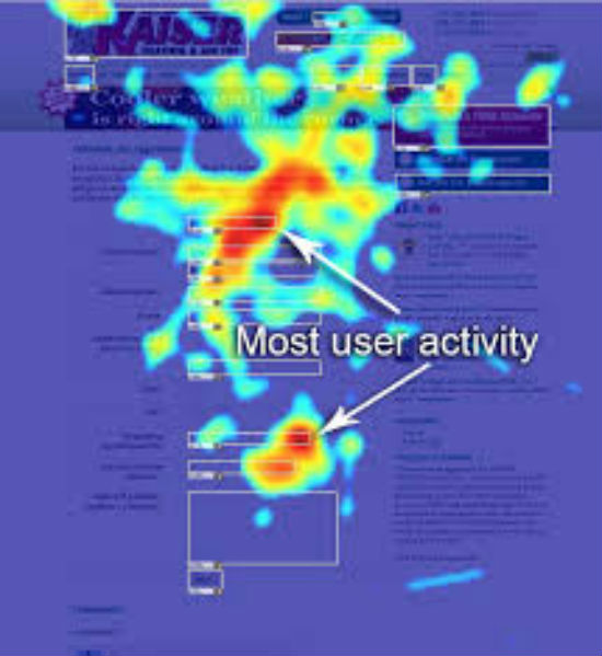
Before we had heatmaps, it was very difficult to analyse the subconscious behaviours of our users, but now we have tools for better analysing their conduct. Heatmaps can track the visual behaviour of our users and lead to insights that aren’t available with other tools.
By collecting this psychological data we can make strategic decisions regarding the layout of our sites to obtain improved conversions.
We will present you with some lessons that have been learned from analysing heatmaps, and show you how you can apply them to your site designs and SEO practices to improve conversions.
Using Heatmaps To Improve Conversions
Website Design Lessons
Place Your Most Important Content Above The Fold
Some users will scroll down, but 80% of their time is spent viewing content that is above the fold.
This is due to an attention span that is limited. Users are trying to get information very quickly and they don’t want to work to get it. The concentration and attention a user will give to your content will wane as they scroll down. This is the reason your above the fold content is most valuable for attracting the attention of your visitors and maintaining it.
Nevertheless, viewing time does increase again at the bottom of a page. This is human psychology at work. People are most likely to pay closest attention to, and recall, the beginning and conclusion of sequential content.
Therefore there are two effects that come into play here primacy and recency. Primacy says that humans will recall beginning information and it will be placed in long-term memory, whereas recency says that information near the end of content will be stored within short-term memory.
It is also interesting to note that visitors spend the majority of their time on the left portion of a page, as opposed to the right. Approximately 70 percent of their time is spent on the left-hand side of a page.
So, how will this affect the design of webpages? Place your most important content in the top portion of your page and toward the left so your visitors don’t need to scroll to see it. In addition, place your call-to-action and reinforce relevant content near the end to appeal to recency (described above) and improve conversions.
Content Is Often Consumed In An ‘F’ Pattern
Web pages are often consumed in an ‘F’ pattern. This is comprised of three elements.
• Users begin by reading across the top of a page horizontally.
• Next, they will read down the page a ways on the left and then begin reading horizontally again.
• Lastly, they will scan down the left side of the page.
This ‘F’ pattern has a number of implications for the way you design your site. Keep in mind that very few of your visitors will read every word of your content. Most often they are looking for specific information. Therefore you will have to be strategic regarding where your most important points are made.
Make it a point to place your most important points within the first paragraphs of your page where your visitors will scan horizontally. There is some chance that visitors will read the content in your first paragraph, but it’s less likely they’ll read your second paragraph word-for-word.
You should also begin your lists, paragraphs, and headings with strong keywords to maintain the attention of your users as they are vertically scanning your page.
Provide Textual Content For Females And Visuals For Males
In eye-tracking studies males and females were asked to look at the profiles of members on a dating website. The results indicate that males focus primarily on images while females spent a lot more time reading textual information. Females spent almost 50% more time reading textual information than males. Males spent most of their time viewing images.
How can this be used in optimising your website? Ensure that your content is appealing to both genders. Make sure you include some appealing visual elements and support it by having textual information too.
Don’t Place Content In Locations Typically Occupied By Ads
People are bombarded with an enormous number of ads every day, so they have developed psychological mechanisms for filtering out the clutter. Website visitors have learned to tune out web elements that appear like advertisements. In particular, they’ve learned not to look at certain parts of web pages that are often occupied by ads. This will include the top banner and the block of content located on the right side of a page.
These two areas of a page will receive almost no attention from site visitors. Consequently, these aren’t great places to place your most important content. You should avoid placing any important information, particularly your call-to-actions near these sections of your page.
Direct Visitors’ Attention With Models’ Eyes
It is basic human behaviour to pick out other people on a page. From the time we’re born we are programmed to recognise human faces as opposed to inanimate objects or animals. Consequently, it is logical to make use of people within your designs to get your viewers’ attention. This is common knowledge. However, are you aware that site visitors tend to look wherever the eyes of your on-page model is looking?
If the model on your page is gazing toward the left, site visitors will follow the line of vision of your model and view the content that is to the left. This can be used to direct the attention of your site visitors toward the content you want them to look at.
Get Rid Of Animated Headers
You will see a lot of animated headers on the web nowadays. Most of us have seen homepage banners that scroll through various products and images. You would think that since these types of headers are so prevalent, that using them would be good practice. However, this is actually not the case.
Studies have found that automated headers are an annoyance to site visitors that reduce conversions.
In one study, users were asked if Whirlpool had any special promotions on dishwashers. This question was answered within an animated header on Whirlpool’s homepage.
The offer to receive a $100 discount was the largest item on the page in terms of font size and space. You would believe that this would be relatively easy to locate. However, most users failed to see it.
Why did this occur? One reason is that people block out banners, like we discussed earlier. The header had elaborate formatting that made it appear similar to a banner ad. In addition, the header would display a different image every 5 seconds. This also tends to kill conversions because:
• Elements that are moving decrease user accessibility for visitors that aren’t able to quickly consume content.
• The chance that a visitor will see the information that they desire is substantially reduced when it is only shown for a brief period of time.
• Moving web elements tend to annoy users
• Most site visitors will assume that a moving element is an ad and ignore it
The take home point is that animated headers should be avoided. If you have a header, it should display a new slide when a user prompts it to, or stand totally still.
Create Emails That Can Be Read In Less Than 60 Seconds
To generate conversions and maintain good relations, sending periodic newsletters can be helpful. Nevertheless, heatmaps have shown that people spend a very brief amount of time reading your content, and read only a portion of it.
Studies have found that most people tend to scan newsletters and on average they will spend about 50 seconds reading them. Less than 20% of people who opened these emails read the entire content.
Therefore, you need to create short, direct newsletters with a clear CTA.
Emphasise Elements For Quick Recognition
Recent studies have shown that when people are rushed or distracted they will select a product that has the greatest visual impact. This occurs because people subconsciously conclude that items that are prominently displayed have greater significance.
You may wonder how frequently your visitors will be in a hurry or distracted? This occurs more frequently than you might think. With tablets and smartphones people are shopping at the last-minute and while on the move. They will often need to come to quick decisions and make easy purchases.
Increasingly, shopping has become more hectic. However, this can be used to advantage. Make the products you want to sell stand out. Make them bolder, brighter, and larger so that they will quickly appeal to your visitors.
SEO Lessons
Recent research conducted by researchers at Cornell University in the United States has come to some conclusions regarding the manner in which users consume the results displayed by search engines. Subjects were provided with several questions on a variety of topics and they were requested to seek the answers using Google search. Eye-tracking was used to identify some interesting trends:
Users take less than five seconds to choose a site
Users decide on a link based upon
• Snippet info – 43%
• Title – 30%
• URL – 21%
Users Click On The First Link That Appeals To Them
If your competition is ranking ahead of you, most users won’t ever look at your link.
Results Are Viewed Top To Bottom
This is the reason being the top search result is so vital. The first two results have the greatest chance of being clicked on.
Users Prefer To Launch A New Search As Opposed To Scrolling
Most people don’t like to scroll, in fact, most would rather start a new search rather than scroll through the search results if what they are looking for is not readily apparent.
Therefore, you need to have a listing that is at least in the top five, you should use rich snippets, and have a relevant title and URL to qualify as a link that is promising.
Conclusion
Heatmaps have given us very useful insights into the web user’s subconscious thought process. We have learned the best places to locate content that is most important, that will include:
• Above-the-fold
• Left side
• Within the first 2 paragraphs
• Where the eyes of your model are looking
We have also learned to not place content that is important:
• In areas typically occupied by ads
• Within animated headers
Heatmaps have also shown us that web content should be:
• Brief and to the point for emails
• Emphasised to stand out quickly
• Informational for females and visual for males
Heatmaps have been used to discover what works best for most sites. Your job is to look at these results and optimise your sites accordingly. If you appeal to the subconscious mind of your users and make these psychological behaviours easy for them, you are bound to experience improved conversion rates.
Check out this video to learn how to use CrazyEgg heatmaps: