![]() Posted by Cameron Francis
on
19 Jun , 2017
in
News Uncategorized
Posted by Cameron Francis
on
19 Jun , 2017
in
News Uncategorized
A few years ago, Conversion Rate Experts made history when they increased MOZ’s yearly revenues by well over a million dollars. Yes, a whopping $1 million!
Do you know exactly how they pulled this through?
Well, I’ll answer that for you and the answer is quite simple.
Moz was a successful company, with thousands of paying customers who generated huge profits.
However, MOZ felt that they were missing out on sales opportunities owing to porous landing pages.
So, they called in Conversion Rate Experts.
Uhhh, no. The findings from these experts unearthed shocking behaviours on how customers used and consumed Moz’s services.
“Some customers weren’t (even) aware of the impressive array of tools they’d get with a paid membership. In addition, they seemed to be confused about which tool was available at which membership level,” Conversion Rate Experts revealed in their findings.
If MOZ was to get more customers to subscribe to their paid solution, they needed to make their value proposition clearer.
“Moz was so accustomed to dealing with major firms as clients that it was somewhat “ho hum” about that fact,” Conversion Rate Experts further explained.
For example, MOZ had picked a very small logo for its landing pages “assuming” that being a big company; everyone would be able to instantly identify with the brand.
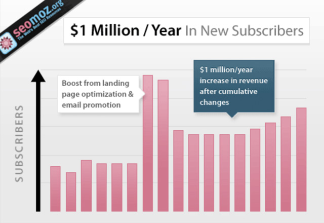
When experts corrected these mistakes by optimising and making a few other tweaks to MOZ’s landing pages, the floodgates opened and soon MOZ was converting lead after lead.
The graph below shows how MOZ’s conversion rates skyrocketed within just four months.
Today, MOZ is one of the world’s leading providers of tools and resources for digital marketing.
Unfortunately, many other brands are still suffering from the same plague Moz had.
You’ve squandered resources in an attempt to optimise your landing page and FAILED!
It’s confusing!
So we made you this.
In the purest sense, a landing page is a web page intended for a visitor to arrive at after clicking a link in response to an ad or an optimised organic search result. Whenever a visitor arrives at a page, webmasters say that they have “landed” on the page.
However, in the case of marketing and advertising (which is our main focus), a landing page is defined as “a standalone web page, distinct from the main site, designed with a single objective in mind – conversion.”
The reason landing pages only serve this one purpose is to avoid the confusion we saw in Moz’s case.
Marketers have discovered that consumers are more likely to complete a transaction if distractions are removed.
RELATED:
Key Hacks for Increasing Your Website’s Conversions
There are seven main elements of any landing page.
Essentially, the headline is the title of your landing page.
The title should be short, concise, and straight to the point.
Use the headline to tell visitors what you’re offering. If it’s a chance to win a gift card, make it known to them just like Chipotle have done below!
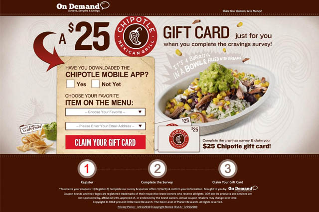
You can see that the title is just 2 words long – Gift Card – which is actually excellent.
However, if you have more things to say, then a subtitle would be handy. In the example above, just after the words Gift Card, Chipotle have added;
“Just for you when you complete the cravings survey.”
This is what is called a subtitle.
Here you can choose to either go for a powerful image or a short, crisp video. As long as you keep everything professional, you will always get the attention of web visitors.
Avoid stock images, or they will definitely fail you. You need originals. If you can’t take your own photos or videos, then hire a professional.
A benefit statement tells people how your item or service will benefit them.
When dealing with benefit statements, be careful not to overstress the features of the product/service while underplaying the benefits. Instead of dwelling on features, such as number of control buttons, tell the consumer why additional/fewer control buttons would make their lives easier.
Make your forms as noticeable as possible without creating a “shouting” effect. Try to make it more visible by using contrasting colour for the background. Yellow or green on a white background will make your form stand out. Still, you can have white on white. Just ensure to keep it clean and visible. Look at the example below;
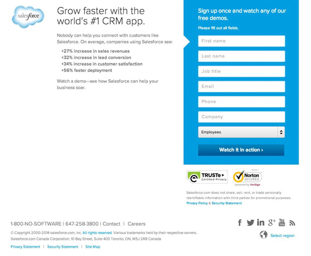
That is one of Salesforce’s landing pages. The blue form against white background is very noticeable.
A Call To Action (CTA) is like the door to your business.
If a consumer clicks on the CTA, then they are knocking on that door, telling you that they are interested in doing business with you.
Landing page CTAs should be simple, clearly visible, and strategically positioned. Here is a detailed CTA guide from HubSpot to get you started.
Experts recommend that the best way to find your ideal CTA is to put yourself in the customer’s shoes and try to complete the phrase; “I want to ….”
Also known as social proof, showing your visitors that a lot of people are already signing up on your page can work magic.
Take social media for instance. You bump upon a post with 15 likes and 12 comments and then just below that, you have another post with 1,500 likes and 1,200 comments.
Naturally, humans will be more attracted to the post with more likes and more comments.
The same applies to landing page conversions. If you tell visitors that 100,000 people have already signed up, then naturally, the visitor would be led to think that whatever you’re offering could be of value to them.
A clever tactic that’s becoming increasingly common is to integrate social media buttons showing that a certain number of people have already interacted with your offer.
Though some businesses aren’t creating post-conversion pages, you’ll reap huge benefits with one.
Any person who fills your form is clearly interested in your business. Take advantage of this by showing them a few more offers immediately after they are done with the form.
For example, you can take them to a page with even more offers or a page with new products that they might like.
You need landing pages to focus the visitor’s attention on a particular task. This has been proven to increase the likelihood of a conversion.
In a nutshell, here is how any digital business would benefit from landing pages:
With a landing page, you will have a clear conversion path. Most businesses are usually promoting more than one product and/or services at a go.
For example, you could be promoting your new eBook while also promoting your email newsletters. When you have separate landing pages for these promotions, you will realise a higher level of conversion.
Landing pages also allow you to capture useful consumer information such as contact information, demographics, and so forth. When this data is analysed, understanding the consumer becomes easier.
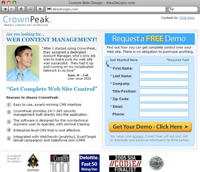
When you have a landing page for each marketing campaign, you can easily track how each campaign is performing.
You’ll clearly see which landing pages are drawing in more visitors, which ones are driving higher conversions, and which ones are recording high bounce rates.
Landing pages are often used to let people know of an upcoming event, product, or service. Use your landing page to build anticipation among your audience.
You could have a landing page with a countdown timer. As the clock ticks away toward the event, anticipation among the audience will keep rising.
Lastly, landing pages are also an effective tool when it comes to A/B-testing marketing campaigns. By creating multiple landing pages and monitoring the traffic to each page, you can effectively know which campaigns are doing well.
As useful as they are, landing pages aren’t always necessary. Sometimes you could just sail by without one.
However, it would be suicidal for your business to embark on the following activities without a landing page:
If you’ll be communicating with various consumer segments, such as people who have only subscribed to a free service vs. those who have subscribed to a paid option, then separate landing pages would make sense. You want to keep the message personalised and targeted at that particular audience without messing with the homepage.
Businesses generally use three main pages to drive a marketing campaign; the homepage, the product description page, and the shopping cart page. Of these three, the product description page usually contains the most marketing information and may thus be considered the landing page.
However, if you’re promoting multiple products, there are chances of the customer wandering off owing to complex navigation.
A landing page can be utilised to make the process simpler. With a landing page, the process would be; ad >>> landing page >>> shopping cart which is simple and guarantees minimal, if any, straying.
HubSpot has a special landing page for pretty much every new eBook they are offering. Here are two random landing pages where they are promoting two different eBooks.
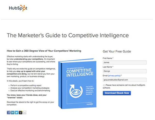
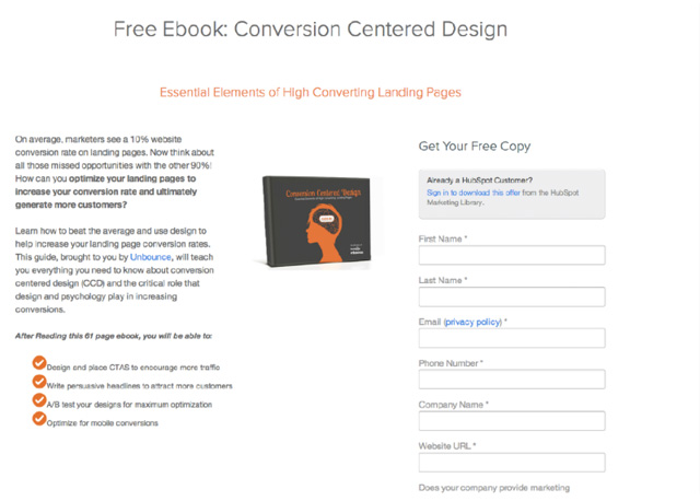
Now imagine if they tried to promote the two eBooks on the same landing page? Would it be even possible?
Consider two different customers. One arrives at a landing page via a 140-character tweet while the other clicked a CTA at the bottom of a 3-paragraph email.
Obviously, the visitor arriving off Twitter will not have heard a lot about your business compared to the one who clicked the CTA in an email.
As such, it would make sense to send these two visitors to different landing pages. If they’re coming off social media, your landing page could provide a little more insight to the product/service.
RELATED: 6 Growth Hacking Strategies That Will Make Your Businesses Unstoppable
Now that we know what landing pages are and what they are made of, the next step is to make them functional. In any case, landing pages are only important if they help you convert a sale.
The term “optimisation” is defined as; “the act, process or methodology of making something as fully perfect, functional or effective as possible.”
Landing Page Optimisation (LPO), therefore refers to the strategies involved in making landing pages more effective at what they are designed to do.
Optimizely defines it as; “the process of improving elements of a landing page to increase conversions.”
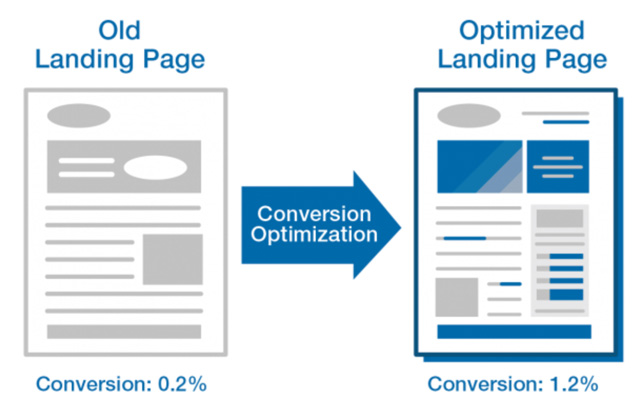
If your landing pages have been leaking leads, perhaps a lot of people arrive at the page but only a very small percentage fill your forms, then you may consider landing page optimisation as a solution. Maybe your CTAs are not appealing enough? Or could it be that the landing page title isn’t very clear.
Optimisation would solve both problems.
The same applies if visitors who arrive at your landing pages often fill a portion of the forms before giving up midway through. In this case, you may want to find out if your forms are too long.
In the next section, we provide a step-by-step guide that should help you to quickly optimise your site for higher conversion rates.
Before we delve deep into the nitty-gritty, it’s important to diagnose your landing pages for obvious signs of trouble and see if you can fix these issues at an early stage.
Here are some of the factors to look out for at this stage;
There is a possibility that the reason your landing pages aren’t converting is because you’re sending visitors to the wrong pages.
Targeted landing pages answer five simple questions as you can see below.
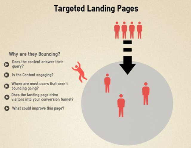
Until you have the right answers to each of these questions, your landing pages cannot be said to be targeted.
One of the most common mistakes marketers make is to send people to the homepage knowing that the homepage isn’t likely to convert a lead coming from a banner ad. Use the homepage for the “curious, explorer” types of leads. If a lead is clicking on a social media ad, you need a special landing page.
If you insist on using your homepage as your landing page for all marketing campaigns, here is what will happen;
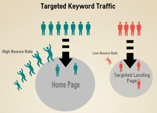
You’ll be working harder but converting less!
Look at your campaign as a stream flowing from the link/banner down to the landing page. At the end of the day, the visitor should be drinking from that same stream. As such, the design, messaging, and tone should remain consistent throughout. If consumers are bombarded with different messages that appear irrelevant, they may abandon the conversion journey.
As with songs, most people, even the performers themselves can’t wait for the chorus. The blabber in between is usually just because it has to be there. But everyone is always waiting for the chorus.
When dealing with online prospects, apply the same approach. Minimise the in-between twaddle and get to the main point as soon as possible.
Granted, you may need a bit of introduction at the beginning. But keep it to a minimum. As we have already seen, the visitors can’t wait to get to the main point!
Your headline should be clear, noticeable, relevant, and strategically positioned on the page. Remember that web visitors are humans just like yourself.
Now, imagine walking along a busy town with all the hustle and bustle. Normally, you’ll only notice adverts that are visible from afara far. A big black headline, for example, would stick out brilliantly from the crowd.
That is exactly what your headlines need to be like:; noticeable at first sight.
Wiki identifies four qualities of a great headline, it allows you to;
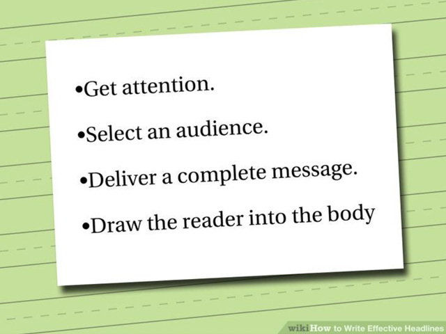
If you have multiple user segments, consider developing separate landing pages for each segment.
A good example is a business that sells tax services to employees and freelancers. These tax services will benefit employees and freelancers differently. So, using the same landing page for both categories of consumers may be unwise.
With regards to traffic segmentation, you may want to personalise your landing pages for channel-specific visitors. While you’ll have a lot of traffic coming in through banner ads, you’ll definitely also have a few coming in through email, PPC, remarketing, and social media.
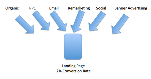
Knowing exactly where each lead is coming from will allow you to determine your best performing channels. And with this knowledge, you can then proceed to budget appropriately for your marketing.
Always put yourself in the visitor’s situation and think about the different things that could distract your attention.
If you can pick out these things, remove them without hesitating. Too much text on a landing page, for example, may cause unnecessary distraction. The same applies to excessive imagery. So, keep these to a minimum.
Navigation remains an Achilles heel for many webmasters. Do I make them scroll in order to access certain content? Should I place a link here that takes them to a page with more information?
The solution is to keep it to a minimum.
You don’t need to do away with navigation altogether, but you must also understand that every link you add further dilutes attention.
Where you put the links also matter. If you’re having problems with navigation, seek expert assistance.
The area above the fold is the region just above the bottom of the screen for any normal browser resolution.
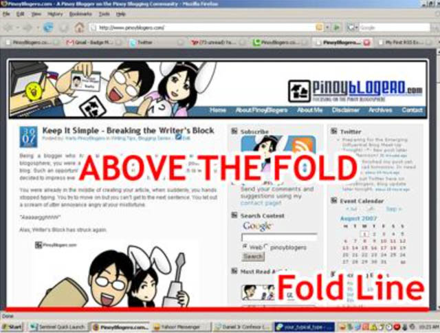
Alongside the top right corner and the middle of the page, the area above the fold is the most commonly viewed area of a website.
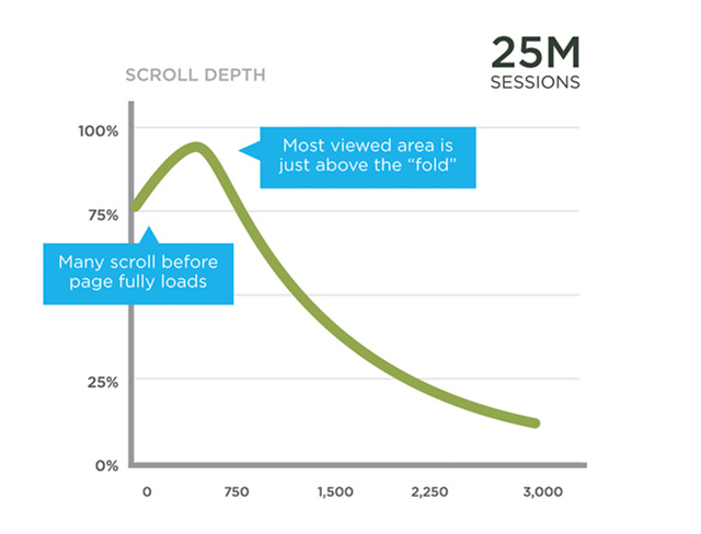
If you’re not placing your CTA at the right hand corner or in the middle of the page, then the area above the fold is the next most ideal position. If your landing pages are longer than the normal screen size, find ways of ensuring that the CTA always appears above the fold even while the visitor keeps scrolling down. This way, he/she won’t have to scroll up again to click on the CTA.
Consistency and congruence mean almost the same thing except that congruence deals more with the particular page as opposed to the conversion process.
Congruence is the concept of ensuring that every element of the page supports your core values. If any part of the page seems to disagree with your value proposition, ditch it.
The digital generation is one that is very difficult to understand. Perhaps a cute video is what you need to convert the sale. So, why not try with a short, nice original video?
The good news is that unlike images, your videos don’t have to be very professional. You’ve seen pretty blurred videos go viral on social media, right? Just tells you that if it’s nice, people will watch it!
If you miss this one in this age and time, then you can’t complain if your landing pages underperform.
Unless your landing pages are designed for a selected few who have already been informed about it, you need to create a buzz around them.
Allowing people to share the news on social media only increases your chances of a conversion.
One research by ShareThis found that social sharing accounts for more than 10 percent of online search and at least 31 percent of site referral traffic.
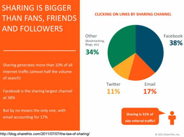
While we are at it, make sharing easy. Don’t make site visitors scroll left to right from the top to the bottom of the page looking for your share buttons. Choose clearly visible buttons and place them in even clearer places.
Anyone who has taken a PayPal survey will agree that these guys do try to be courteous. At the end of the page, they always have a warm thank you message that will leave you feeling truly appreciated.
This is exactly what you need to copy. At the end of any form, let the customer know that you are really grateful for their time. They’ve just spent a valuable five minutes filling your form. Surely, you need to show appreciation.
RELATED: A Step By Step Guide To Landing Page Optimisation
No one wants to be the next victim of data theft. That’s why people are becoming increasingly wary of online forms and landing pages in general.
You need to show authority, convince your visitors that their information is safe with you, and make them feel safe about filling in your forms.
But it’s not just the consumers. If search engines suspect that your site is malicious, they will warn users about it and you won’t like how they do it! Look at the page below for example.
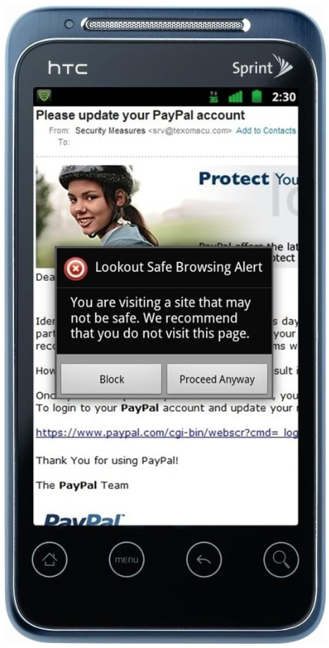
Is that a genuine PayPal web page? You can’t tell but the browser is clearly warning the user not to visit it.
Here are a few things you can do to show that your site is safe and secure;
A phone number is usually the number one sign that there is a real person at the other end. So, it automatically helps in filling your customers with confidence.
Below is one of the landing pages for insurethebox.com. You can see their phone number at the top right corner written in bold green.
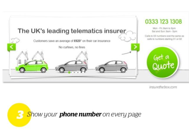
Aside from functioning as a security feature, a phone number could be an ideal fall-back option if there are people who like your offer but aren’t happy to fill your forms. They can simply dial the number and speak with the customer care department.
People will raise eyebrows if you’re demanding certain critical user data for a reward that doesn’t appear to be of high value.
For example, if you’re offering access to a “FREE” eBook but demanding that the visitor first completes a 2-page form, then some people may see this as being exploitative.
Be reasonable with your offers. If you’re looking to beef up your email list, then asking people to fill in their names and email address would be sufficient. Asking them to also provide their phone number might sound suspicious.
Consistency also helps in breeding trust. When your banners and landing pages don’t seem to come from the same family, people will feel suspicious. And whenever that happens, you’ll lose business.
Don’t change even the colours. The best idea is to use your brand colours that people are already familiar with. We all know that Microsoft loves blue and Google mixes green, red, yellow, and blue. A purple banner ad from Microsoft would therefore raise eyebrows.
Even the messaging needs to remain consistent.
Digital consumers have become so fed up of these two that someone might quickly exit your landing page just because you have one of them. They tend to associate such content with malicious websites.
If you’ve worked with/ for major companies that people are already aware of and which the general public already trusts and respects, don’t hesitate to mention them. You can say;
“We work with Bed, Bath and Beyond.” Or, “Our customers include BBC Australia…”
Testimonials work just like endorsements. In this case, real life customers tell their stories of how they benefited from your services. A past customer might write something like;
“I like the restaurant, the waiters are quite respectful.”
Any new customer who comes across such comments would get a positive feeling about the restaurant in question.
If you want them to believe you, tell them you have won numerous awards in the past and still counting! Display your certifications from a credible body showing you’re a qualified service provider.
To show that your site is secure, get a badge from your web security services provider. They will be happy to provide one.
In one study by clickhealth.com, digital consumers were asked which security badges make them trust a website when they’re browsing the internet. Here is how they responded;
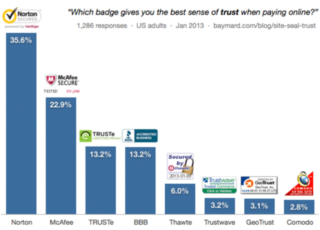
In other words, a Norton Secured badge on your site will leave your site visitors very confident of their security.
For short term promotions, SEO might not matter, but if it you’re in it for the long haul, you’ll need to optimise your landing pages for SEO. Here is what to do;
Remember that we defined a “landing page” as any page that the visitor lands on. In that case, every page of your site is a landing page. Have you optimised them accordingly for search engines?
The reason for this is that Google and other search engines are better at crawling text as compared to images. If you want your headline to also help with overall site ranking, then text headlines make perfect sense.
The advantage here is that landing pages, unlike full websites, don’t need all the gloss. This gives you the opportunity to keep things clean with pure HTML structures.
It can be an eBook or a whitepaper, or even a chance to enter a competitor where the winner wins a present. These rewards can help you gain more leads. Just say something like;
“Sign up and get my free eBook” like dontmesswithmama.com have done below;

If someone thinks that the eBook on offer could benefit them, they will hurry to fill your forms.
If your PPC ads are relevant in that you appear to be getting a lot of things right, then Google will reward you with a higher Quality Score, which in turn leads to lower cost per keyword chosen. One way you can improve your ad relevance is to make your ad content as close as possible to the content on your landing page.
Some marketers rely solely on gut instinct and personal opinion. Steer clear of that camp. Instead, leverage the power of testing to determine what you’re doing wrong and what you’re doing right.
A/B testing will allow you validate your decisions. By comparing the performance of two campaigns, you should be able to determine which option would most benefit your business.
So, what exactly should you test?
Most landing pages are intended for a particular audience segment. It could be your customers who are aged 18-35 years, it might be your female customers, or it could be retirees. It is always good to try different images that provide varied emotional responses.
While an image of a smiling happy old fisherman may evoke emotions of happy retirement, the image may not appeal to your younger audience.
With CTAs, try varying the message from time to time to see which message gets the most clicks.
However, ensure that each time you tweak the text, the core message remains the same. You want to choose words that people will like, not change the offer.
When it matters, also test the primary message. Some of the factors you need to test include the length of the copy, the colour, and the orientation/layout.
Marketers are split over which colour is the most ideal for landing page buttons. While a majority believe that red is the best colour, some came up with theories suggesting that as long as the button colour contrasts the colour of the rest of the page, then it will work just fine.
At MailChimp, they use red CTA buttons;
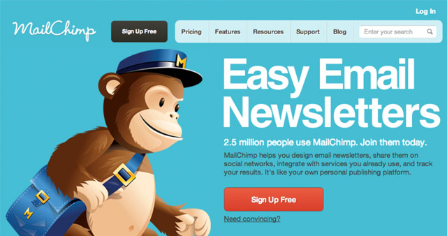
Remember that red is also used as a negative “STOP” colour. So, you shouldn’t go overboard with it.
How long should the form be? How many fields should it have? The rule of thumb is to keep your fields to a minimum.
Forms that are unnecessarily long may quickly bore the visitor causing them to abandon the process or avoid filling it in the first place.
If you need more data for your tests, the better idea is to run more than one test. This way you can test more hypotheses without pissing off the visitors.
We have already mentioned forms a lot in our discussions. That’s because forms play a critical role in landing page success. If your forms suck, your campaign isn’t going far.
Assuming that you already have forms for your landing pages but you suspect that they are not up to scratch, here are a few optimisation strategies that you can call on;
Remove unnecessary fields: Sure, you want as much data as possible. But on the other hand, do your website visitors have all the time to fill 50 fields? Are they happy to do it?
The form below comprises only two fields; name and email address. You’d bet that visitors find it quite attractive.
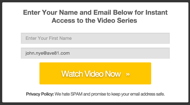
Use directional clues to draw attention: If you want someone to fill a form, make them know about it. If you don’t say it, how are they going to know?
Leave a lot of white space: Forms aren’t blog posts. You don’t need 500 words to create a form. In fact, the fewer words used, the better.
A lot of white space means less distraction.
Button size: Big shiny buttons is the way to go. Those small hidden buttons can only raise more eyebrows.
“That must be a scam,” people will start to think. “Otherwise, why would they be hiding it?”
So, don’t be afraid of shiny, big buttons.
Make field text easy to read: People can’t fill a field is they can’t read what you’re trying to say.
“Is that an ‘e’ or an ‘o’? It’s a little blurred.”
Whenever it comes to this, rest assured that you’re losing valuable leads.
Make the benefits obvious: Your form should make it clear how the visitor would benefit if they filled the form.
You can say;
“Fill the form below to get our FREE eBook.”
Or;
“Fill the form below to stand a chance of winning a trip to space!”
If people feel that you’re just wasting their time with the form filling, they will not even stop to look at the form. If you don’t make the benefits obvious, they may also feel it’s a waste of time.
RELATED: Steps for Improving Landing Page Conversions
Here are several CTA optimisation strategies that would help;
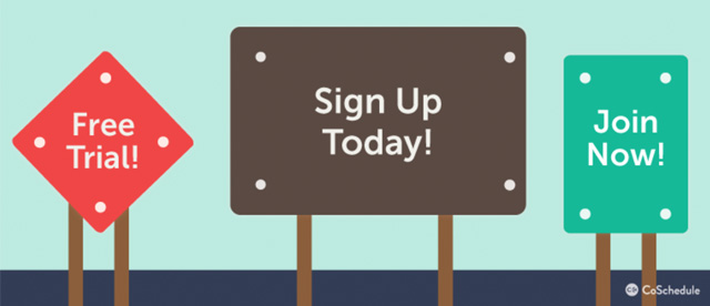
If it’s a “free trial,” it better be a free trial. If it’s a “sign up today,” don’t mince your words.
If you’re offering an eBook, normally, you’ll want people to download the book. So, you need to avoid “submit” and “subscribe” buttons.
Say something like;
“Download eBook”
If you’re asking visitor to subscribe to your emails, then you need to use “Subscribe” buttons. In a nutshell, don’t leave people confused about what will happen when they click the CTA button.
Related to the above point, never promise one thing in your CTA and then offer something completely different at the other end. If someone is clicking the CTA to download an eBook, make sure that what they will be getting is an eBook.
If your offer is a “FREE eBook,” ensure that it is free indeed. Claiming that the eBook is free and then asking for $15 on the next form will drive visitors away.
Overselling can take many forms. The bottom line, however, is that a lot of people don’t like it. Extreme adjectives like; Breathtaking, Awesome, and Kick-Ass will leave visitors questioning your professionalism.
There are three positions on the webpage that work extremely well for CTAs:
Try to fit your CTAs in one of these three areas.
Placing the CTA at the very bottom of the page where the visitor has to scroll before finding it will hurt your conversions.
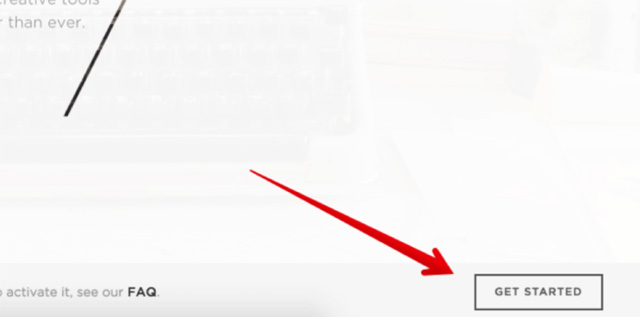
Let the CTA have enough room to breathe – visually. You want the CTA to stand out. So, don’t choke the life out of it by placing it in the middle of a long paragraph. In the image above, you can see that the CTA exists in a world “of its own!”
Measuring performance is a must. Without measuring, it is impossible to tell your progress. You won’t know if whatever strategies you’ve applied are working or not.
You should measure landing page performance for two main reasons;
The best case scenario is to measure everything about your landing pages. But if you’re just getting started, measure the following three main aspects of performance;
Below is an example of a company that tracks these three key metrics (the total entries metric is similar to our form completion rate)
![]()
There are certain online tools that will allow you to measure your metrics on the go. Then, you can also choose to work with service providers who get paid to monitor the metrics for you. The choice is yours.
There are plenty of analytics tools out there. The Google Analytics tool is one of the most popular because it’s also free of charge.
However, there are also several paid options including; GetClicky.com, KissMetrics.com, and HaveAMint.com. These tools allow you to track results immediately. If your CTA buttons are killing the business, you will be able to tell immediately.
From time to time, you’ll hear people discussing landing pages on social media and forums.
“I like how PayPal just asks for your name and email address. Not like Google who also wants your phone number,” Jane would say.
“I am never giving my phone number to anyone online,” Jackie would reply. “It doesn’t matter if it’s the mighty Google!”
When you listen to these conversations, you’ll find out what people like about form filling processes and what they resent.
Where exactly are they looking; the CTA, the headline, or the main message? Eye tracking software will give you the answer to that question. If most site visitors are looking at the left hand corner of the site, then perhaps you could put some vital information at that corner.
Software programs such as the one offered by CrazyEgg.com allow you to map the movement of the cursor around the screen. You will also be able to know which links get the most clicks, like in the example below.
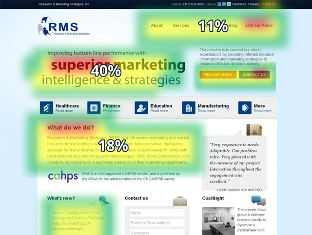
You can then use this information to test copy in the most popular areas.
RELATED: Optimising Conversions On Your Landing Pages
Apparently, landing pages are crucial components of any marketing campaign.
In one study by UnBounce.com, they managed to lift the conversion rate of a certain landing page by 25 percent (from 2% to 27%).
And all it took were four simple tweaks. In this guide, we have discussed dozens of strategies that you can start applying today.
If four simple tweaks are raising conversion rates from 2 percent to 27 percent, imagine what the tips discussed here could do for your landing pages!