![]() Posted by Cameron Francis
on
03 Nov , 2021
in
Company News
Posted by Cameron Francis
on
03 Nov , 2021
in
Company News

We’ve been making a ton of changes behind the scenes with our business over the last 18 months. Like many businesses we have been forced to adapt and pivot which has meant making a lot of changes in order to not just survive, but thrive in the current economic and business climate.
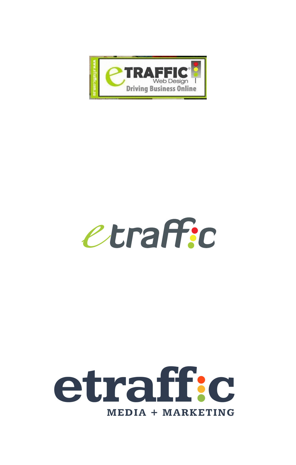
One of the changes that we felt was necessary was to change our logo to freshen up our image and our brand. We felt that the old logo was no longer representative of who we are now as a company, so we decided it was time for an upgrade.
It’s fair to say that the new logo for our company was a long time coming, and we’re excited to share it with you. In order to keep up with the latest design trends, which are moving towards flat design and simplicity, we decided to go down that path as well by simplifying some elements of our logo while keeping its essence intact.
Our new design is modern, bold and fun! It also matches one of our key goals at ETRAFFIC; increasing your website traffic through organic search engine results.
We wanted something that would be easy to remember, but not too generic or common. We wanted something more versatile than our previous logo because it can be used as an icon, or on social media and other digital platforms, without losing its impact.
As part of this process, we sat down and thought about a number of different factors that make a great logo. This includes things such as:
So with these things in mind, we set about creating a logo that took these things into consideration and the following is the way we went about it:

A quick way to see if your logo is well-designed in terms of memorability is to look at it for 3 seconds, close your eyes and then when you open them try drawing the logo from memory. If what comes out looks very similar or identical to what you just saw – that’s an indicator that your logo is simple yet memorable.
We decided that having a unique ‘e’ and the traffic light ‘i’ caused confusion by having 2 icons. In an attempt to be uniform, simple and memorable we decided to make the traffic light the centrepiece and make the rest of the logo uniform.
A logo that is symmetrical has elements of equal weight located on either side of a centre line. When designing an asymmetric logo, the designer should use opposite weights to create a balance that maintains equilibrium.
As humans, we appreciate balanced designs as well-proportioned logos strike a balance between various elements within the design that makes sense to our brains.
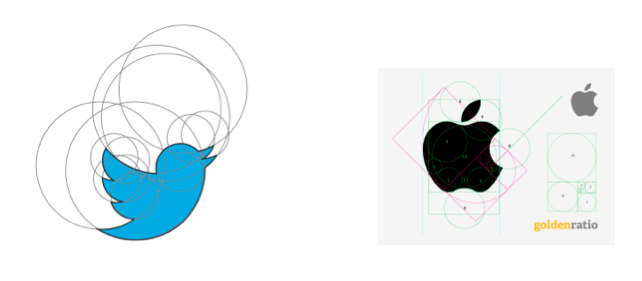
The best logos are designed using principles of proportion and symmetry. We can see from the logos below how both the Apple logo and the Twitter logo utilise circles of proportionate values as well as symmetry to create a pleasing, well balanced aesthetic quality.

A great way to make your logo more memorable is by keeping it simple. If the logo can’t be remembered and scaled down, then you need to remove unnecessary components or details that aren’t essential in conveying a message. Visual effects like shadows, outlines/bevels/gradients serve as distractions for viewers and complicate concepts instead of making them easier to understand.
We updated our logo because we wanted to communicate the evolution of ETRAFFIC not just over the last 18 months, but for the next ten year and beyond. We’ve grown from a small business operation of just a couple of people into one of the biggest digital marketing companies in Melbourne.
As a result, we feel we needed to update our logo so that it would better represent the values and culture behind our brand. With a new simple and well-balanced layout, this refreshed logo reflects where we are now in terms of both size and vision for the future.